The flyer is the first impression of your event. In underground culture, it’s also a statement of intent. A bad flyer signals a bad event. A generic Canva template signals that the promoter doesn’t care enough to build a visual identity. The design system we built treats flyers as brand artifacts, not disposable advertisements.
The constraints
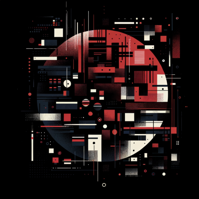
Three colors only. Red (#B30000, Blood Red — not pure #FF0000, which lacks sophistication). Black (#000000). White (#FFFFFF). No exceptions. No gradients. No additional accent colors. The constraint forces every design decision to work within a narrow palette, which creates instant recognizability across any feed.
Red is the brand color for a psychological reason, not an aesthetic one: red is the most eye-catching color. It stimulates attention, appetite, and spending. On Instagram, flyers use red on black. On physical prints, the editorial approach shifts to monochrome with red as a “seal” or accent.
Two fonts. SF Pro Display for body text and event details. Times New Roman for headliner names. Serif for legacy and authority. Sans-serif for modern clarity. The tension between the two is the typographic identity.
The structure
Every flyer follows the same three-section layout, always left-aligned on a 1080×1920 canvas:
Section 1: Date and location. Top-left, always identical placement. A three-line event stamp that never moves.
Section 2: Headliner name in Times New Roman. Supporting acts below in SF Pro Display. The copy hierarchy leads with vibe and brand, not venue. Event name first, headliner second, date and venue third, supporting acts fourth, ticket link last.
Section 3: CTA text number and partner logos. The SMS CTA is universal and never varied: TEXT ‘DARK’ TO (833) 912-4216.
Dark background. Minimal text. Must communicate underground-but-credible. Too polished reads corporate. Too rough reads amateur.
The ego-first principle
The single most effective flyer design principle: make it about the DJ. DJs share flyers that make them look important. If their name is prominent, if the design is hard, if they feel like the star — they post it organically without being asked.
Don’t assume DJs will promote. Assume they won’t. Then design the flyer so beautifully that they can’t resist sharing it. Collab posts with 3-4 DJs for the first 24 hours maximize reach. Rotate collab groups across the lineup. Headshots and flyer approvals are standard DJ onboarding for every event.
The highlight post approach: feature each DJ individually with their own dedicated post. This gets them excited and turns each artist into a promotional node.
Physical flyers
1,000 flyers printed per event at approximately 80 cents per page. Cut into squares for distribution at competing events, clubs, and through promoters. Each physical flyer can carry a DJ’s name and a QR code. Fans bring the flyer to the door for $5 off, and the DJ gets $5 credit per returned flyer.
Physical flyers remain a core channel despite digital dominance. They work in the spaces where phones are away — on dancefloors, in smoking areas, in the hands of someone who just had a conversation about where to go next weekend.
The evergreen vision
The long-term direction: a single brand flyer that can be used for every event without edits. All event-specific information lives on the ticketing page, including the lineup. Zero Figma work per event. A QR code links to the Posh profile. One flyer to rule them all.
This is the Berghain model applied to flyer design: stop marketing individual events. Start marketing the calendar. Typography-only or vibe-clip creatives. Headliner directory with upcoming appearances. Email and SMS replace flyer distribution. The flyer becomes a culture object, not a sales tool.
Ad creative versus flyer
Flyers and ad creatives serve different purposes. Cold ads use crowd footage — energy, vibe, movement — not lineup information. Same text overlay across all creatives for brand consistency. Warm and hot ads include full event info overlays.
Optimal cold ad: 8-12 seconds. Not 15 — shorter completion rates boost the algorithm. Hook in 1.5 seconds. Two quick dancefloor clips at 1.5 seconds each. Social proof shot. CTA. Every visual change happens within 1-1.5 seconds. 1080×1920, 30fps. Reels outperform flyers for cold audiences. Flyers work for warm and hot audiences who already know the brand.
A flyer is a brand statement compressed into a single image. Build the system once — palette, fonts, layout, hierarchy — and every future flyer is a variation on the theme, not a reinvention. Consistency is what makes it recognizable. Recognizability is what makes it trusted.