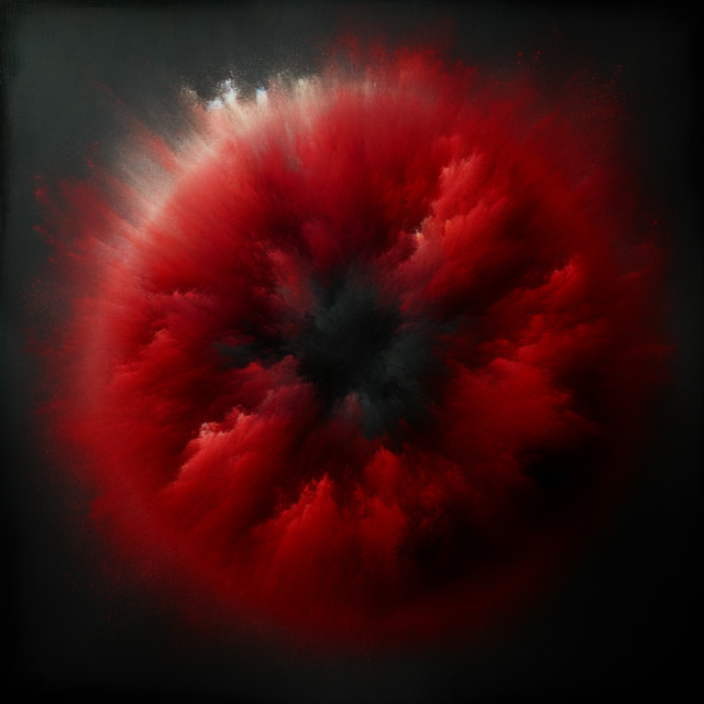
Every SLIST flyer, ad, and branded piece of content runs through a red filter. Not because red is a cool color for a techno brand (though it is). Because red is the most eye-catching color in the visible spectrum. That is not an aesthetic preference. It is a psychological weapon.
The science
Red stimulates attention, appetite, and spending. There is a reason fast food chains use red in their branding. There is a reason casinos drench their interiors in red light. The color triggers a physiological response — elevated heart rate, heightened alertness, increased impulsivity — that is directly useful in two contexts: stopping someone’s thumb from scrolling past your content, and encouraging someone to spend money at a bar.
SLIST’s bar revenue optimization thesis runs through every operational decision, including visual design. If the brand color primes the audience for spending before they walk through the door, the bar numbers benefit. If the ad creative grabs more attention per impression, the cost per click drops. If the flyer stands out in an Instagram feed dominated by black-and-white techno aesthetics, the organic share rate increases.
Red is not a brand identity choice. It is a conversion optimization choice.
The competitive advantage
The underground techno scene in New York has a visual monoculture. Dark backgrounds. White text. Maybe some gray gradients. The occasional strobe photo. Every flyer looks like every other flyer because every brand is optimizing for the same signal: we are dark, we are serious, we are underground.
SLIST’s red cuts through this like a siren in a library. When someone is scrolling through a feed of 15 techno event flyers, 14 of them are monochrome. The red one gets the thumb-stop. That thumb-stop is worth more than any amount of design sophistication on a flyer that nobody pauses to look at.
The consistency compounds over time. After a few months of red-filtered content, the color itself becomes a brand signal. People start recognizing SLIST content before they read the text, the way a Coca-Cola can is identifiable from across a room before you can read the logo. Brand color as pattern recognition, not decoration.
The production system
The red filter is part of a larger creative system. One flyer per event with a video background and text overlay. The same overlay for consistency, different background videos per ad. The overlay is clean, minimal, direct: artist names, date, venue, ticket link. No FOMO language. No busy design. The red filter unifies everything visually while allowing each event to have its own background energy.
For Meta ads: cold ads use crowd footage (energy, vibe) with the red filter, not lineup information. The crowd footage triggers aspirational desire — people want to be in that room. Warm and hot ads include full event information overlay. The red filter stays constant across the entire funnel, from first impression to conversion.
DaVinci Resolve for all video editing. 4K resolution. H.264 codec (not H.265 — broader compatibility). The brand color palette is dark, industrial, red accents. Every piece of content that leaves the production pipeline has been through the same filter chain.
Beyond the flyer
The red extends into the physical space. Minimal lighting with red accents is a standard request to venues. Additional haze is requested for every event. The visual environment of a SLIST event is designed to match the visual environment of the brand’s digital presence. When someone walks into a SLIST event and sees the same red-lit, fog-heavy atmosphere they saw in the Instagram Reels, the brand promise is confirmed. That confirmation is worth more than any amount of production spectacle.
That is why I use red. Most eye-catching color. The explanation is five words. The return on those five words is measurable in every bar receipt, every ad metric, and every flyer that gets shared instead of scrolled past.